AIS Toolbar Update
The AIS has now a centralized support for the two usual toolbars (topic-wide and request-wide). This requires some changes to all components, as the way an AIS content field is rendered has changed.
The API to the new toolbar is described in the file /lib/midcom/helper/toolbar.php and can already be seen in the PHPDoc dumps.
Two toolbars are available, using the global variables $midcom_admin_content_toolbar_main and $midcom_admin_content_toolbar_component. They represent the Main, topic-wide toolbar, and the local, per-request toolbar, respectivly.
Toolbars can be set only during the handle phase of your content admin request, and the topic-wide toolbar will have a few elements in it already, which you must not touch.
Changes to the components
The new AIS framework automatically renders a Topic-Title (component name) heading, as this has grown to the well-known de-facto standard nowadays. You therefore have to remove this from your component. It searches in the component for an l10n string of the topic's component identically to the component path (e.g. de.linkm.taviewer), which is then used in the heading. So be sure to have this string in your l10n database. It is advised to use the same string in the component properties name key MIDCOM_PROP_NAME.
Of course, you have to change your styles to no longer include any manually-generated topic-headings or toolbars.
See the component de.linkm.taviewer for a full working example.
Example preparations
The following examples assume that you create references to the toolbar within your class:
...
var $_local_toolbar;
var $_topic_toolbar;
...
    $this->_local_toolbar =&
        $GLOBALS['midcom_admin_content_toolbar_component'];
    $this->_topic_toolbar =&
        $GLOBALS['midcom_admin_content_toolbar_main'];
...
Example usage of the topic-wide toolbar
Use this to add a topic-configuration to the main toolbar:
$this->_topic_toolbar->add_item(Array(
    MIDCOM_TOOLBAR_URL =>
        'config.html',
    MIDCOM_TOOLBAR_LABEL =>
        $this->_l10n_midcom->get('component configuration'),
    MIDCOM_TOOLBAR_HELPTEXT =>
        $this->_l10n_midcom->get('component configuration helptext'),
    MIDCOM_TOOLBAR_ICON =>
        'stock-icons/16x16/stock_folder-properties.png',
    MIDCOM_TOOLBAR_ENABLED =>
        true
));
This is best done at the beginning of the handle phase. Note, that the component configuration strings are in the main MidCOM l10n library. Of course, you can disable this button in case the user is in the configuration screen:
$this->_topic_toolbar->disable_item('config.html');
You need not revert to the default behavoir of add_item too, which is adding a button at the end of a toolbar. Instead, you can use the second parameter to specify the index, before which you want to insert an item:
$this->_topic_toolbar->add_item(Array(
    MIDCOM_TOOLBAR_URL =>
        '',
    MIDCOM_TOOLBAR_LABEL =>
        $this->_l10n->get('create article'),
    MIDCOM_TOOLBAR_HELPTEXT =>
        null,
    MIDCOM_TOOLBAR_ICON =>
        'stock-icons/16x16/stock_new.png',
    MIDCOM_TOOLBAR_ENABLED =>
        true
), 0);
In this case the index 0 indicates insert before the first element (which has the array index 0). You could also use an toolbar URL here, as with disable_item().
Example usage of the request-local toolbar
You can as easily add a few buttons in your own request toolbar:
$this->_local_toolbar->add_item(Array(
    MIDCOM_TOOLBAR_URL =>
        "edit/$id.html",
    MIDCOM_TOOLBAR_LABEL =>
        $this->_l10n_midcom->get('edit'),
    MIDCOM_TOOLBAR_HELPTEXT =>
        null,
    MIDCOM_TOOLBAR_ICON =>
        'stock-icons/16x16/edit.png',
    MIDCOM_TOOLBAR_ENABLED =>
        true
));
$this->_local_toolbar->add_item(Array(
    MIDCOM_TOOLBAR_URL =>
        "delete/$id.html",
    MIDCOM_TOOLBAR_LABEL =>
        $this->_l10n_midcom->get('delete'),
    MIDCOM_TOOLBAR_HELPTEXT =>
        null,
    MIDCOM_TOOLBAR_ICON =>
        'stock-icons/16x16/trash.png',
    MIDCOM_TOOLBAR_ENABLED =>
        true
));
The examples from the global toolbar, like disable_item, work too for the local one, of course.
One special operation, which only works for the two AIS toolbars (they are in fact of the type midcom_admin_content_toolbar, which is derived from midcom_helper_toolbar), is the ability to explicitly disable the view page link. For example, somewhere within a maintainance page, which has no logical view-this-page equivalent but would get redirected to the on-site topic root page, you could do this:
$this->_local_toolbar->disable_view_page();
This will prohibit the link from being active, it is still shown for consistency though. Before you ask: You cannot remove it from your component, as the link is added to the toolbar's end just before rendering.
Additional toolbars within your content area
It is possible, to create additional toolbars within your content area quite easily, even with a different style. The following example is taken out of net.siriux.photos, that displays a short toolbar with edit, delete and approve links for each image in the index (in the future some image manipulation stuff will be added here). Usually, you will invoke the toolbar code directly in your admin style elements.
So what we do now, is take a short walkthrough to the integration of this. First of all, as we are in a loop, we will not generate a completly new toolbar on each iteration. Instead, we prepare it once, before actually entering the loop, with the correct number of elements in it already, and all variable parameters set with empty strings, nulls, or whatever you like (42 is good as well...). Of course, the following example will assume that all variables in there are defined somewhere, I will not go into the guts where they come from. Read the photo gallery code if you're interested. Lets go ahead now:
// Create and prepare a toolbar
$toolbar = new midcom_helper_toolbar('midcom_toolbar midcom_toolbar_in_content');
$toolbar->add_item(Array (
    MIDCOM_TOOLBAR_URL => '',
    MIDCOM_TOOLBAR_LABEL => $GLOBALS['view_l10n_midcom']->get('edit'),
    MIDCOM_TOOLBAR_HELPTEXT => null,
    MIDCOM_TOOLBAR_ICON => 'stock-icons/16x16/edit.png',
    MIDCOM_TOOLBAR_ENABLED => true
));
$toolbar->add_item(Array (
    MIDCOM_TOOLBAR_URL => '',
    MIDCOM_TOOLBAR_LABEL => $GLOBALS['view_l10n_midcom']->get('delete'),
    MIDCOM_TOOLBAR_HELPTEXT => null,
    MIDCOM_TOOLBAR_ICON => 'stock-icons/16x16/trash.png',
    MIDCOM_TOOLBAR_ENABLED => true
));
$toolbar->add_item(Array (
    // This one is for the approval
    MIDCOM_TOOLBAR_URL => '',
    MIDCOM_TOOLBAR_LABEL => null,
    MIDCOM_TOOLBAR_HELPTEXT => null,
    MIDCOM_TOOLBAR_ICON => null,
    MIDCOM_TOOLBAR_ENABLED => true
));
As you can see, it is actually rather trivial. Each command adds a new toolbar item at the end of the list (so we have an implicit numbering from 0 to 2 here), with all common stuff being set in advance. Notable here is the last one, tagged for approval, it will contain either an approve or an unapprove link when we are finished, depending on object state. Since this affects almost all properties (the ENABLED one stays clear in this case), we have null's or empty strings otherwise.
Ah, and in case you are wondering why I didn't use the default constructor of the toolbar class: The first parameter is the class to use for the unordered list that represents the toolbar. While midcom_toolbar would be the default, resulting in a toolbar like the two default ones, there is another style, called midcom_toolbar_in_content, that makes the toolbar a bit "lighter". Since this is an "additional option" for the main toolbar CSS template, you need to specify both (using the 'multiple classes' feature of CSS). The rules from the second class do overwrite the first ones. (For the geeks: They are overwritten because of the order of the class definitions in the CSS file, not because of the order in which they are set in the class='' tag in the HTML source.)
The interesting part now is the actual index loop; it fills up the holes in the toolbar template in each iteration and displays it (the code is a bit long for these on-site blocks, so please excuse the inconsequent indentation.):
if ($view_ids)
{
    // Render table header
    foreach ($view_ids as $id)
    {
        // Initialize and redner content objects


// Now we update the toolbar to the current values and render it:

$toolbar->update_item_url(0,
    "edit/{$data['_storage_id']}?startfrom={$view_startfrom}");
$toolbar->update_item_url(1,
    "delete/{$data['_storage_id']}?startfrom={$view_startfrom}");

if ($data['approved']['timestamp'])
{
    $toolbar->update_item_url(2,
        "?startfrom={$view_startfrom}&unapprove={$data['_storage_id']}");
    $toolbar->items[2][MIDCOM_TOOLBAR_LABEL] =
        $GLOBALS['view_l10n_midcom']->get('unapprove');
    $toolbar->items[2][MIDCOM_TOOLBAR_HELPTEXT] =
        $GLOBALS['view_l10n_midcom']->get('approved');
    $toolbar->items[2][MIDCOM_TOOLBAR_ICON] =
        'stock-icons/16x16/approved.png';
}
else
{
    $toolbar->update_item_url(2,
        "?startfrom={$view_startfrom}&approve={$data['_storage_id']}");
    $toolbar->items[2][MIDCOM_TOOLBAR_LABEL] =
        $GLOBALS['view_l10n_midcom']->get('approve');
    $toolbar->items[2][MIDCOM_TOOLBAR_HELPTEXT] =
        $GLOBALS['view_l10n_midcom']->get('unapproved');
    $toolbar->items[2][MIDCOM_TOOLBAR_ICON] =
        'stock-icons/16x16/not_approved.png';
}
echo $toolbar->render();

    }
}
Again, the code is actually trivial, we use the indexes from the sequence of buttons from the initialization of the toolbar, and assign them the correct URLs. If we were perfect, we would have made the indexes variable, assigning the actual integer values to some variables during setup, that would make changes later easier, but that is not strictly neccessary.
Note, that the URL has not been updated by direct assignement to the array but with the update_item_url helper function, that correctly translates relative URLs. You don't need to use this helper, but it usually will make things far easier and safer for you.
Complete example look & feel
Here is an example screenshot with all three types of toolbars visible (albeit, the request toolbar is not populated in this case), click the image to view the full version:
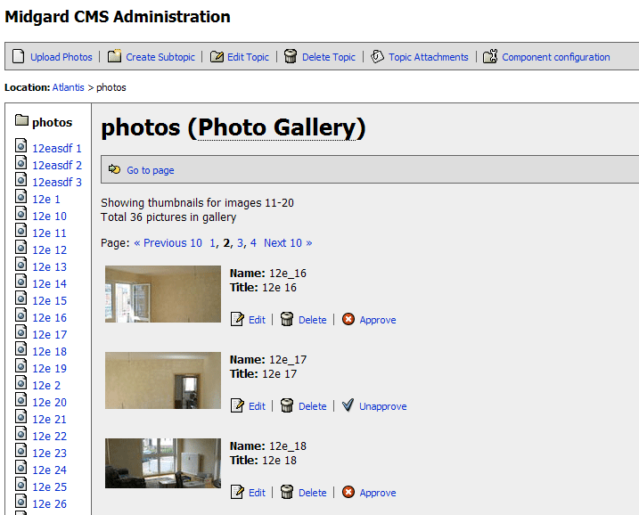
This is about as good as it gets within AIS. You are encouraged to stick to the default toolbar CSS styles, mailnly so that the AIS UI stays consistent. Also, don't forget that the default toolbar style of MidCOM is designed for 16x16 icons, the MidCOM stock icons have a good collection of 16x16 icons already. If you need new ones, take them out of the GNOME stock icons.
One final feature has not yet been explained, which makes all this even better:
The NAP toolbar interface
The idea is, that a component can register toolbar information with NAP. These toolbars are generated on demand when they are requested. The components only add an array with toolbar compatible data to NAP. You can use this data on-site to display a component specific context menu. The article NAP Toolbar Interface illustrates this feature. Go ahead and continue reading there.
Oh, and this NAP toolbar information could easily be used in AIS to create right-click context menus.
 Generic static content erstellen
 Komponente konfigurieren
 Bearbeiten
 Löschen